About
The purpose of this site is to help compare the estimated out-of-pocket costs between different health plans. The process of choosing a health plan can oftentimes become an overwhelming mess of different terminology (deductibles, out-of-pocket maximums, HSA contributions, etc.). Ultimately, what most people want to know is "what will this cost me?"
The out-of-pocket cost for a health plan is always a function of your total health care spending, but that function depends on the details of the health plan. This site generates graphs that help you visualize this.
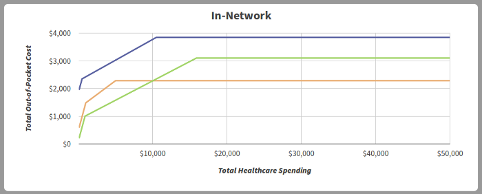
Thinking about health plans in this way can help simplify the process of comparing different health plans. Consider the following example:

Each line in the graph above represents a different health plan. The x axis is your total health care spending for a given year, and the y axis is your out-of-pocket cost (i.e. what each plan will end up costing you). Visualizing these health plans in this way demonstrates that the "green" plan makes sense if you don't expect to need much health care (i.e. the out-of-pocket cost is the lowest for the smaller health care spending values). But if you end up needing more than ~$10,000 in health care, the "orange" plan is going to be your better option. In this example, it's clear that the "blue" plan never makes sense, as it will always result in a higher out-of-pocket cost, regardless of how much health care spending you have.
Using the site

Use the checkboxes at the top to set the number of health plans you'd like to compare. This will also allow you to easily add or remove plans from the graphs while keeping the plan information saved.

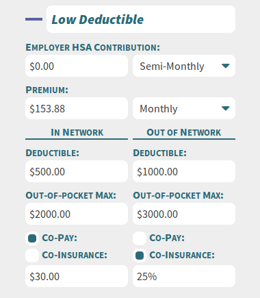
Health plan information is then entered into the fields in the left sidebar. This is also where you can change the names of your different plans. See the definitions below for help understanding different terms.
Graphs are displayed for in-network and out-of-network costs for individuals. In the future we hope to add more graphs to help compare other scenarios, such as family health plans.
Definitions
Total Health Care Spending
This is your expected annual health care costs. This is plotted on the horizontal (x) axis of the graphs.
Total Out-of-Pocket Cost
The total cost of your premium, employer HSA contributions, and out-of-pocket health care costs including co-insurance / co-pays. This is plotted on the vertical (y) axis of the graphs.
Premium
The set cost of your health insurance plan, typically paid either monthly or bi-weekly, depending on the plan. This amount is due regardless of how much you use your health insurance. If your employer offers discounts based on achieving certain health metrics, enter the amount you expect to pay, including discounts.
Employer HSA (Health Savings Account) Contribution
Your HSA account is a pre-tax account that can be used for qualifying health costs when you have a high deductible health plan. Unlike an FSA, your HSA rolls over each year and can be treated as an IRA after retirement. If you use HSA funds for non-medical costs before retirement, a tax penalty is applied. Both your employer and you can contribute to your HSA account. Your employer contribution in this model is treated as a full deduction of your total out-of-pocket cost.
Deductible
This is the amount of money you must pay out-of-pocket before your insurance benefits begin.
Out-of-Pocket Maximum
This is the maximum amount of money you will have to pay out-of-pocket for health care costs. Note that this does not include premium costs or HSA contributions. Therefore, it is different than the total out-of-pocket cost from when the graphs plateau toward the end.
Co-Pay
This is a form of co-insurance that is a set amount per office visit due up front before services can be rendered. For modeling purposes, we assume an average cost per visit of $200 for this model.
Co-Insurance
Your responsibility for health care costs after your deductible but before your out-of-pocket maximum.
In-Network
Refers to providers that your insurance carrier has negotiated contracts with. Since these providers provide discounts to the insurance carrier, the cost to you is typically lower. If you plan to use in-network providers, you should focus on the in-network graph.
Out-of-Network
Refers to providers that your insurance carrier does not have negotiated rates with. Since these providers do not have set discounts for the insurance carrier, the cost to you is typically higher. Ensure to take this graph into account if you plan to travel or if your typical providers are not in-network with your planned insurance carrier.
Disclaimer: This site is intended to show approximate cost of health care to an individual or family and may not work for all health plans. This site is merely an informational tool and should not be the basis for your health plan decisions. All parties associated with this site are not liable for any health care costs incurred due to your health plan selection.
Questions? Comments? Feedback? Please contact us!